
Two purchases or no purchases? Make up your mind YouTube.
Two purchases or no purchases? Make up your mind YouTube.
I was browsing on my phone the other day and thought I saw a hair on the screen. Take a look..

Turned out to be clever (perhaps evil) attempt to get me to tap of the button. Here’s a closer look at the graphic…

Something I’ve noticed more and more with the iPhone X is I accidentally trigger some modes a lot more than I ever did with previous models. Here are 14 screenshots and pictures (actually a lot more since five of these are burst modes) I took today while leaving the gym.

Two other things I trigger all the time are the Apple Pay prompt and Emergency calling. Thankfully I haven’t called an emergency contact yet. Maybe it’s because I enabled Raise to Wake for use with Face ID, which was never enabled before.
Does anyone else have these issues?
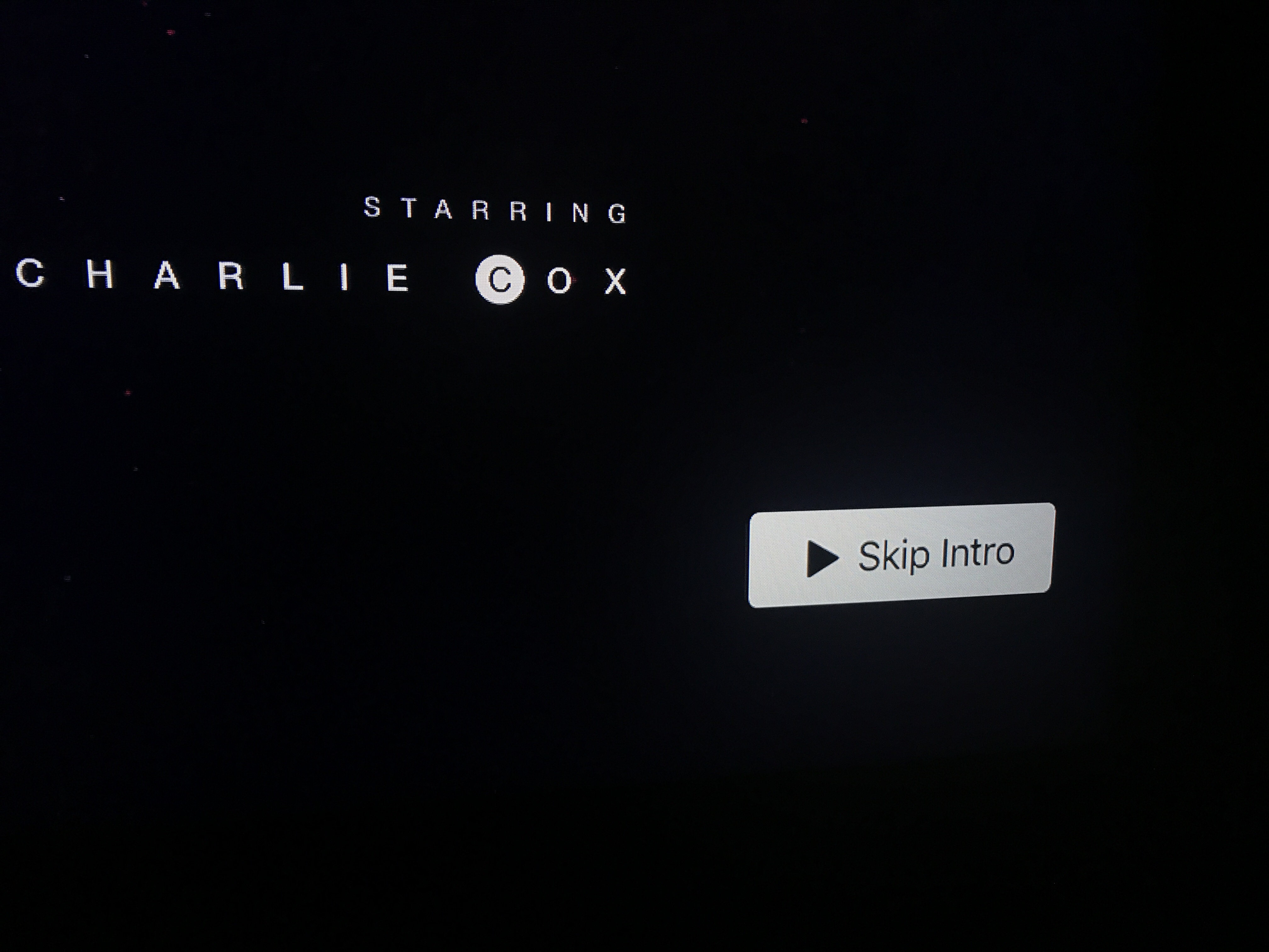 This new Skip Intro feature on Netflix is long overdue.
When I bought a new Apple TV (quite awhile ago), I moved the 3rd Generation model to my office where I had a small TV not connected to anything. I’ve rarely used it since, but turned it on a couple of times in the last week to play something from YouTube. After using the new remote with the touchpad for so long, it’s quite a shock to pick up this ancient model. Having to navigate by clicking buttons seems so foreign. Don’t even try to fast forward or rewind to a specific point in a video.

Caches are great for speed, but when they don’t update often enough, it’s a confusing experience in an app or on a web site. I use YouTube Subscriptions almost every day on my AppleTV and it rarely shows me the latest videos, which I can see when browsing my subs on youtube.com in a browser. There’s no obvious way to force a refresh in the AppleTV app, but I found these tips in the Google Forums.
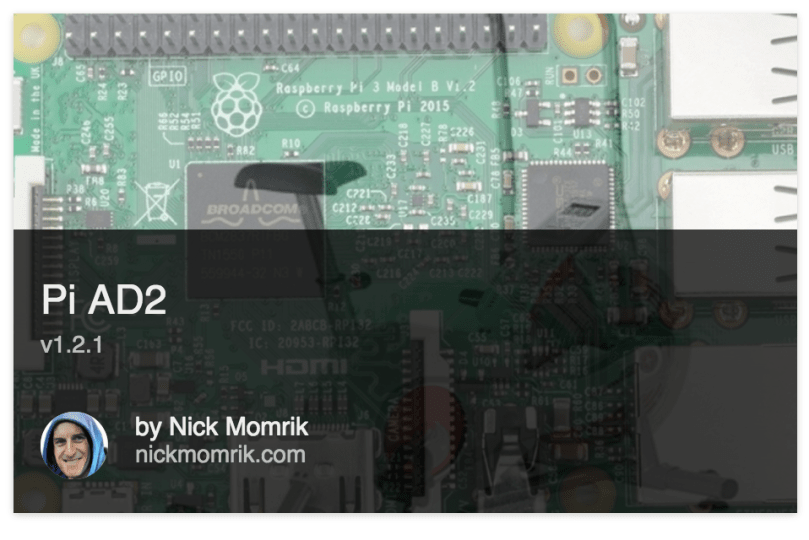
While developing Pi AD2, 90+% of the testing was done on my Mac. Over Thanksgiving I did use the actual Pi for a 10 minute workout on Dad’s Airdyne, but the UI, code, and formulas are all completely different now. It was unclear how well everything would work on the Pi’s hardware. After a longer 20 minute workout yesterday, I couldn’t ask for better accuracy.
When I finished the workout, the Airdyne showed 458 calories and 6.68 miles, while Pi AD2 showed 455 calories and 6.68 miles. That’s an accuracy of 99.3% for calories and 100% for distance! See for yourself…if you can even see the display. 
I did uncover some usability issues and determined I need to prioritize getting the production build to work. Having to wait for the development build to run can take a minute or more. I should also make the app launch on boot since I don’t use this Pi for anything else.
Finally, part 5 gave you a look at the interface I built. A week later, the app looked nothing like version 1.
The long Thanksgiving weekend was a productive one for the project. I spent a lot of time researching different packages to help with development and planning what to do next. I knew I was going to use React to build the user interface and I’d used webpack for bundling modules before. Setting some of this stuff up can be a pain, so I used webpack-express-boilerplate to get started. I’m using React Router for the routing library (keeps the UI in sync with the URL).
I wanted to pull in a set of components so I didn’t need to build everything from scratch. I don’t enjoy design work anyway. I eventually settled on React Toolbox, but that didn’t last long because I was running into theming issues right away. Material-UI had been a very close second on my list and I’m happy I made the switch.
I pretty much rewrote the entire app, limiting what the server handled and passing all of the calculations off to the client side where I could leverage React. Then last night after Jeff provided a time interval tip I ended up rewriting all of the timer code to be simpler and account for browser time shifting. This led me down a few different roads and it dawned on me that the Airdyne might actually do its calorie calculations with every single spin detection instead of at set intervals. Reworked all of that calculation code. Created even better metronome sample data and was able to get a new calorie formula where the coefficient of determination is 1.0, which means it’s perfect for the provided data! In a couple of tests the calorie error rate is now down around 1%.
Here’s where I’m at with version 1.2.1.

Switch between light and dark themes. The distance switch should speak for itself.
The Spin Detection settings actually control thresholds for sound detection. Depending on the device these may need to be adjusted. I’m using a circular progress component on the right side to show that spins are being detected (you have to be using the machine). As you can see, when I change one of the settings too much it no longer can “hear” (detect) the spin. Maybe I should make the progress indicator to a complete revolution for each spin detection. If anyone has any UI thoughts on this area, please share in the comments.
The layout of all of the data has changed from v1, but to toggle from km to miles and rpm to watts works the same with a simple tap of the area.
I didn’t like the individual action buttons in v1, especially with how touchy, or should I say non-touchy, my Raspberry Pi LCD is. Now the entire timer section is the action button. I put a faded icon there as a visual clue about the action. Giving the timing area a lot more room helps for the next feature on my to-do list.
Intervals are an important piece that is lacking from the Airdyne’s computer and limit how I’ve been able to use the machine at home. With so much room in the timing section I’ll be able to display an interval number and the upcoming interval or rest period. To go along with intervals, the Main Menu will get a new section for Custom Workouts. Initially it’ll have some pre-loaded workouts, such as Tabata, 20 rounds of :30/:30, 10 rounds of 1:00/1:00, Airdyne Hell (10 rounds of 0:15/1:45), 10:00, 30:00, etc. You get the idea.
Once that’s all working, I’ll implement a screen to create and save custom interval workouts. Those could be repeating intervals where you select:
Intervals could also be variable. For example 5-4-3-2-1 miles with a one minute of rest between each. Or 3:00 work, 1:00 rest, 1:00 work, 2:00 rest, 4:00 work, 1:00 rest. Endless possibilities. Similar to the computers on Concept2 rowers and ski ergs. I’d like to allow custom names when saving a custom creation, but I can’t think of how to make it a good user experience on the Pi.
If you’re doing intervals, it seems natural to save log files of each workout. Those can be used to calculate lifetime calories, distance, and time which will be displayed on the splash screen. Maybe have options to email the log files. Possibly some historical charts or other analysis. I have a lot of notes with potential ideas.
An area I definitely need to address is building the app for deployment. Might need to be the next thing to tackle because right now I have the git repo cloned to my Pi. Launching the app is very slow because it has to finish the development build process. The boilerplate did set some stuff for a production build process but it’s not working or I didn’t properly update it as I made changes to everything.
Anyway, that’s all I have for now. I’ll post updates when I have something cool to share.
I think I spent more time writing these 6 posts than I did coding version 1 of the app. 🙂 If you made it this far, thanks for following. Everything is on GitHub if you want to check it out. If you have an Airdyne AD2 and use the app, I’d love to hear about it. Leave a comment or email me. I can see this app being forked and used for other fitness machines too. I know I had an elliptical years ago that was pretty basic and had a similar cable. Maybe I’ll spend some time making it easier to swap out a module to use for different devices.
The 4th part of this series was all about data and math. I like numbers, so it was exciting for me, but probably not for a lot of people.
I continued working on the user interface and tweaking how my app dealt with the data and formulas. Little changes in rounding decimal places could make a big difference. Eventually I got to the point where the UI had the basics to call it v1. It was just before midnight on the 20th, so I went from nothing to a functional interface over a weekend. It’s pretty much all I did for 2+ days.
I woke up on Monday and the damn calorie formula was still bugging me. I read through the Google Charts documentation again. I hadn’t even thought to try other types of trendlines, though I knew it wasn’t linear. The exponential example looked like the chart from the other Airdyne project I’d been referencing so I hadn’t thought twice about it. I couldn’t remember what a polynomial was so I looked it up. That project came up with a polynomial formula of degree 2.
I quickly changed my chart and immediately saw a better trendline with my plotted data. I’d been looking for the wrong type of trendline. I created a JSFiddle if you want to try your own.

The new calorie formula is nearly perfect! I’ve tweaked things a bit here and there and have seen less than a 2% difference from the actual display.
Go back to part 1 and check out the video of the Airdyne AD display if you don’t remember how it works and then compare to this new one…
I don’t show it until the end after I got off the Airdyne, but the toggling between imperial and metric distances can be done while working out too. Same with the switch from RPM to watts. I decided to keep the watts as an option even though I have no idea if they are right. It’s simply using the formula I found. What do you think? Which interface is better?
The code at this point was pretty ugly but function was the focus. The server listens for “beeps,” stores timestamps, and every second calculates new information for the different panels. Then it uses a Socket.IO Server to emit events with this data. Express handles all of the web server bits. What you see in this video is a browser in full screen mode with some simple HTML and CSS, a Socket.IO Client to listen for events from the server and emit a few action events back to the server, jQuery, and a little more javascript. Both the server and the client are on a single Raspberry Pi 3 Model B.
As a bonus, due to this structure, you don’t even need to have a display connected to a Raspberry Pi. If the Pi is connected to the same WiFi as a smart phone, tablet, or computer (something with touch is probably the best) you can use the device’s browser. In fact you don’t even need a Raspberry Pi. You can run the server from a Mac, which is how I’ve done all of the development.
This is a pretty simple UI but it does everything I was hoping I could do in a first version. The final post will show off the changes I’ve made in the last week (basically everything) and share my future plans.
In part 3, I explained the troubles I had reading microphone input through a USB adapter and how I eventually made progress by using a package to “listen” for sound.
Since the Airdyne sends a sound with each revolution of the flywheel, the RPMs were easy. I did some averaging over a number of revolutions to get a stable number. I had found formulas in a spreadsheet shared on the Airdyne Erg Trending post, so it was easy to plug in the formulas for calories and watts (even though my model doesn’t display watts). Distance and speed go off one another, so I jumped on the bike to collect some data.
When the machine stops/pauses, it continues to cycle through the 5 pieces of information and keeps the last number there. So I pedaled for 10 seconds or so, stopped, waited, and then recorded the speed (distance would be too inaccurate in such a short period of time) and rpms. Reset the display and repeat going faster each time. Threw the numbers in a spreadsheet, got a ratio, did some averaging, and worked both ways backwards with the average.

Looking back, I think I went a little overboard with getting so many samples. Miles per hour came out to be the RPMs divided by 3 ⅓. With a formula for every piece of info, my program output to the command line so I could see it in action. I jumped on the Airdyne, and used the audio cable splitter so I would get output on both displays. The RPM, distance, and speed were fairly accurate right away, but the calories were not even close.
I looked over the formulas to make sure I didn’t make a mistake, but didn’t see anything. I went back to the blog post and finally realized I had a different Airdyne model. I don’t know how I overlooked that when he was mentioning watts, which mine doesn’t show, and he has a big picture of the display right in the post. Anyone who has used several different models of the Airdyne can tell you that calories are much easier or harder to rack up from model to model.
In his post, Preston mentioning using an Excel chart, to get a formula from a trendline. I had no idea what this magic was. I don’t have Excel, so I searched to see if Google Spreadsheets could do the same thing. I found something even better, Google Charts does it, so I could write copy/paste code. 😉
Now I needed sample calorie data that I could plot on a chart. I was back out to the garage and hopped on the Airdyne. This was tricky. Since my goal was to find out what different average RPMs for 1 second would equate to in calories, I tried to maintain a constant speed for 36 seconds. Had to do 36 because it takes 30 seconds to cycle through the display and another 6 to get back to calories. I adjusted my program to keep track of the RPMs and calculate an average over the 36 seconds. I recorded both numbers in a spreadsheet and repeated the process over many times, with increasing speeds.
After getting a calorie per second average I plotted the points on the chart and voila! I got a trendline and a formula. The calories were looking much better. Still not awesome, but I figured it could be due to how I was averaging out RPMs, how I was rounding, or how often I was calculating everything. I started building a graphical display because I was getting tired of looking at command line output. At some point I got in a 10 minute “workout” and recorded a sound file on my computer and kept track of the calories so that I could pipe that back through my app for testing. I wish I had written some kind of simulator to eat through the data and spit out numbers.
I kept going back to the formula though. It was bugging me. What was I doing wrong? Finally it dawned on me how to get perfect data out of the Airdyne. Feed it perfect data and take the human element out of it. I could use a metronome since all the computer cared about was hearing something! Back out to the garage. I already had MetroTimer on my iPhone, so I plugged it into the Airdyne computer and recorded new calorie data at different speeds. I had new chart points and a much better formula. Still not accurate enough, but at least I was confident it wasn’t a problem with my data.

In the next post, I’ll give you a look at version 1 of the app.
